
The “Shrinking Design” Mistake
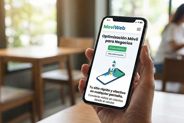
Many people think that having a responsive website simply means making the design smaller. But true mobile design is about usability .
-
Clickable buttons: Have you ever tried to tap one button and ended up tapping another because they’re too close together? That’s a mobile design mistake.
-
Readable text: Nobody wants to zoom in to read your services. The text should be the right size from the very first second.
-
Images adapted: Giant photos that look good on a monitor can take forever to load using mobile data.
-
Intuitive navigation: Complicated menus should be transformed into simple, thumb-friendly “hamburger” menus.
How does DapSite help make your website “Mobile-First”?
Google no longer evaluates your website based on its desktop appearance; it now uses Mobile-First Indexing . If your mobile version is poor, your ranking will drop. With our support, we take care of:
-
Multi-device testing: We don’t just test on one browser; we check how your website looks on different screen sizes and operating systems (iOS and Android).
-
Mobile speed optimization: We adjusted the code so that users with 4G or 5G connections have an instant experience.
-
Correction of overlapping elements: We fix those annoying errors where text goes over the edges or images cover the content.
-
Quick action buttons: We configure “Call now” or “WhatsApp” buttons that only appear on mobile phones to facilitate direct contact.
Having a website that isn’t 100% mobile-friendly is like having a store with half the merchandise hidden. In this age of immediacy, every second of user frustration is a lost sale.